线图
线图是反映趋势变化的一种方式,其输入数据一般也是一个矩阵。
单线图
假设有这么一个矩阵,第一列为转录起始位点及其上下游5 kb的区域,第二列为H3K27AC修饰在这些区域的丰度,想绘制一张线图展示。
profile="Pos;H3K27ac
-5000;8.7
-4000;8.4
-3000;8.3
-2000;7.2
-1000;3.6
0;3.6
1000;7.1
2000;8.2
3000;8.4
4000;8.5
5000;8.5"
读入数据(经过前面几篇的联系,这应该都很熟了)
profile_text <- read.table(text=profile,header=T, row.names=1, quote="",sep=";")
profile_text
H3K27ac
-50008.7
-40008.4
-30008.3
-20007.2
-10003.6
03.6
10007.1
20008.2
30008.4
40008.5
50008.5
#在melt时保留位置信息
# melt格式是ggplot2画图最喜欢的格式
#好好体会下这个格式,虽然多占用了不少空间,但是确实很方便
#这里可以用`xvariable`,也可以是其它字符串,但需要保证后面与这里的一致
#因为这一列是要在X轴显示,所以起名为`xvariable`。
profile_text$xvariable =rownames(profile_text)
library(ggplot2)
library(reshape2)
data_m <- melt(profile_text,id.vars=c("xvariable"))
data_m
xvariable variable value
1-5000H3K27ac8.7
2-4000H3K27ac8.4
3-3000H3K27ac8.3
4-2000H3K27ac7.2
5-1000H3K27ac3.6
60H3K27ac3.6
71000H3K27ac7.1
82000H3K27ac8.2
93000H3K27ac8.4
104000H3K27ac8.5
115000H3K27ac8.5
然后开始画图,与上面画heatmap一样。
# variable和value为矩阵melt后的两列的名字,内部变量, variable代表了点线的属性,value代表对应的值。
p <- ggplot(data_m, aes(x=xvariable,y=value),color=variable) + geom_line()
p
#图会存储在当前目录的Rplots.pdf文件中,如果用Rstudio,可以不运行dev.off()
dev.off()
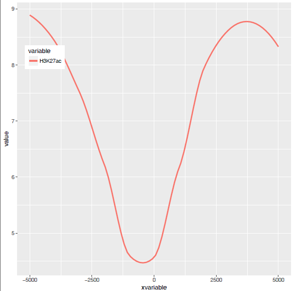
满心期待一个倒钟形曲线,结果,
什么也没有。
仔细看,出来一段提示
geom_path: Each group consists of only oneobservation.
Do you need to adjust the group aesthetic?
原来默认ggplot2把每个点都视作了一个分组,什么都没画出来。而data_m中的数据都来源于一个分组H3K27ac,分组的名字为variable,修改下脚本,看看效果。
p <- ggplot(data_m, aes(x=xvariable,y=value,color=variable,group=variable)) +
geom_line() + theme(legend.position=c(0.1,0.9))
p
dev.off()
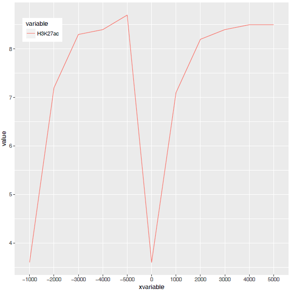
图出来了,一条线,看一眼没问题;再仔细看,不对了,怎么还不是倒钟形,原来横坐标错位了。
检查下数据格式
summary(data_m)
xvariablevariablevalue
Length:11H3K27ac:11Min.:3.600
Class :character1st Qu.:7.150
Mode:characterMedian:8.300
Mean:7.318
3rdQu.:8.450
Max.:8.700
问题来了,xvariable虽然看上去数字,但存储的实际是字符串(因为是作为行名字读取的),需要转换为数字。
data_m$xvariable <-as.numeric(data_m$xvariable)
#再检验下
is.numeric(data_m$xvariable)
[1]TRUE
好了,继续画图。
#注意断行时,加号在行尾,不能放在行首
p <- ggplot(data_m, aes(x=xvariable,y=value,color=variable,group=variable)) +
geom_line() + theme(legend.position=c(0.1,0.8))
p
dev.off()
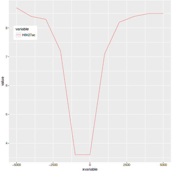
图终于出来了,调了下legend的位置,看上去有点意思了。
有点难看,如果平滑下,会不会好一些,stat_smooth可以对绘制的线进行局部拟合。在不影响变化趋势的情况下,可以使用(但慎用)。
p <- ggplot(data_m, aes(x=xvariable,y=value,color=variable,group=variable)) +
geom_line() + stat_smooth(method="auto", se=FALSE) +
theme(legend.position=c(0.1,0.8))
p
dev.off()
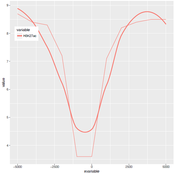
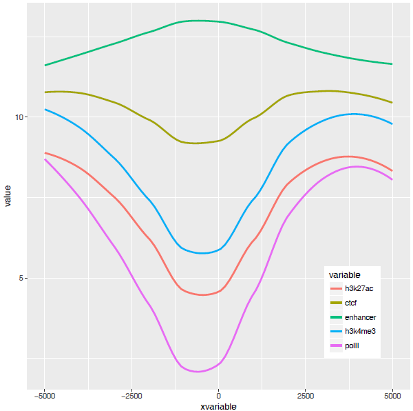
从图中看,趋势还是一致的,线条更优美了。另外一个方式是增加区间的数量,线也会好些,而且更真实。stat_smooth和geom_line各绘制了一条线,只保留一条就好。
p <- ggplot(data_m, aes(x=xvariable,y=value,color=variable,group=variable)) +
stat_smooth(method="auto", se=FALSE) +theme(legend.position=c(0.1,0.8))
p
dev.off()
好了,终于完成了单条线图的绘制。
多线图
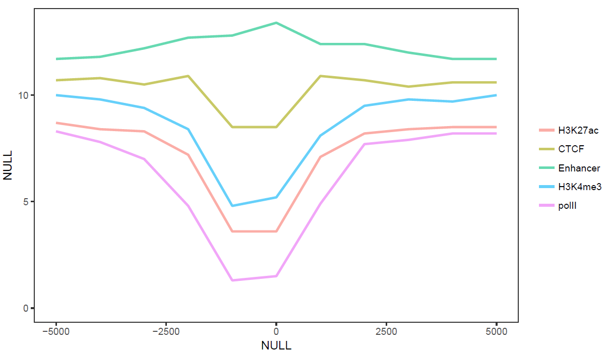
那么再来一个多线图的例子吧,只要给之前的数据矩阵多加几列就好了。
profile ="Pos;h3k27ac;ctcf;enhancer;h3k4me3;polII
-5000;8.7;10.7;11.7;10;8.3
-4000;8.4;10.8;11.8;9.8;7.8
-3000;8.3;10.5;12.2;9.4;7
-2000;7.2;10.9;12.7;8.4;4.8
-1000;3.6;8.5;12.8;4.8;1.3
0;3.6;8.5;13.4;5.2;1.5
1000;7.1;10.9;12.4;8.1;4.9
2000;8.2;10.7;12.4;9.5;7.7
3000;8.4;10.4;12;9.8;7.9
4000;8.5;10.6;11.7;9.7;8.2
5000;8.5;10.6;11.7;10;8.2"
profile_text <- read.table(text=profile,header=T, row.names=1, quote="",sep=";")
profile_text$xvariable =rownames(profile_text)
data_m <- melt(profile_text,id.vars=c("xvariable"))
data_m$xvariable <-as.numeric(data_m$xvariable)
#这里group=variable,而不是group=1 (如果上面你用的是1的话)
# variable和value为矩阵melt后的两列的名字,内部变量, variable代表了点线的属性,value代表对应的值。
p <- ggplot(data_m, aes(x=xvariable,y=value,color=variable,group=variable)) +
stat_smooth(method="auto", se=FALSE) +theme(legend.position=c(0.85,0.2))
p
dev.off()
横轴文本线图
如果横轴是文本,又该怎么调整顺序呢?还记得之前热图旁的行或列的顺序调整吗?重新设置变量的factor水平就可以控制其顺序。
profile ="Pos;h3k27ac;ctcf;enhancer;h3k4me3;polII
-5000;8.7;10.7;11.7;10;8.3
-4000;8.4;10.8;11.8;9.8;7.8
-3000;8.3;10.5;12.2;9.4;7
-2000;7.2;10.9;12.7;8.4;4.8
-1000;3.6;8.5;12.8;4.8;1.3
0;3.6;8.5;13.4;5.2;1.5
1000;7.1;10.9;12.4;8.1;4.9
2000;8.2;10.7;12.4;9.5;7.7
3000;8.4;10.4;12;9.8;7.9
4000;8.5;10.6;11.7;9.7;8.2
5000;8.5;10.6;11.7;10;8.2"
profile_text <- read.table(text=profile,header=T, row.names=1, quote="",sep=";")
profile_text_rownames <-row.names(profile_text)
profile_text$xvariable =rownames(profile_text)
data_m <- melt(profile_text,id.vars=c("xvariable"))
data_m$xvariable <- factor(data_m$xvariable,levels=profile_text_rownames, ordered=T)
# geom_line设置线的粗细和透明度
p <- ggplot(data_m, aes(x=xvariable,y=value,color=variable,group=variable)) +
geom_line(size=1, alpha=0.9) + theme(legend.position=c(0.85,0.2)) +
theme(axis.text.x=element_text(angle=45,hjust=1,vjust=1))
# stat_smooth
#p <- ggplot(data_m, aes(x=xvariable,y=value,color=variable,group=variable)) +
#stat_smooth(method="auto", se=FALSE) +theme(legend.position=c(0.85,0.2)) +
#theme(axis.text.x=element_text(angle=45,hjust=1, vjust=1))
p
dev.off()
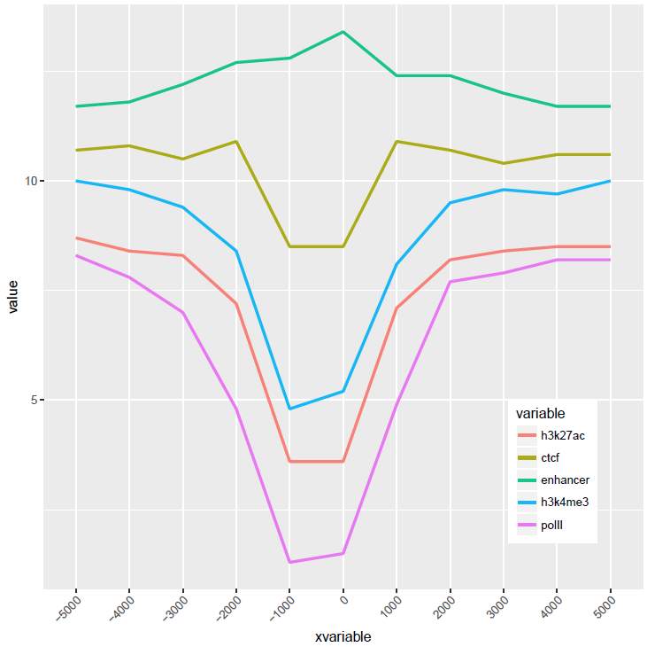
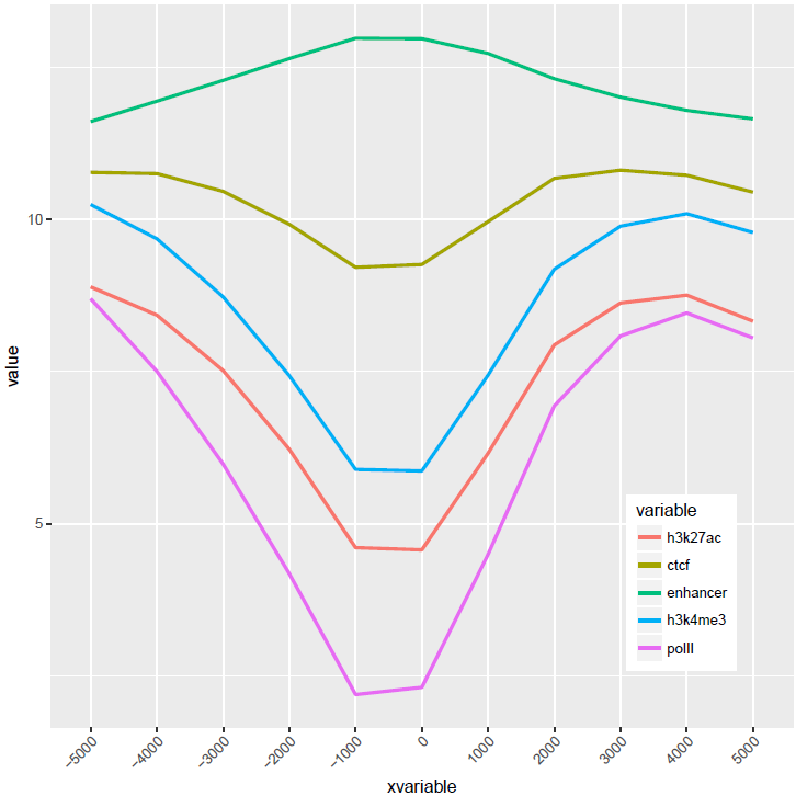
比较下位置信息做为数字(前面的线图)和位置信息横轴的差别。当为数值时,ggplot2会选择合适的几个刻度做标记,当为文本时,会全部标记。另外文本横轴,smooth效果不明显(下面第2张图)。
至此完成了线图的基本绘制,虽然还可以,但还有不少需要提高的地方,比如在线图上加一条或几条垂线、加个水平线、修改X轴的标记(比如0换为TSS)、设置每条线的颜色等。具体且听下回一步线图法。
线图-一步绘制
绘图时通常会碰到两个头疼的问题:
1.有时需要绘制很多的图,唯一的不同就是输入文件,其它都不需要修改。如果用R脚本,需要反复替换文件名,繁琐又容易出错。(R也有命令行参数,不熟,有经验的可以尝试下)
2.每次绘图都需要不断的调整参数,时间久了不用,就忘记参数怎么设置了;或者调整次数过多,有了很多版本,最后不知道用哪个了。
为了简化绘图、维持脚本的一致,我用bash对绘图命令做了一个封装,通过配置修改命令行参数,生成相应的绘图脚本,然后再绘制。
首先把测试数据存储到文件中方便调用。数据矩阵存储在line_data.xls和line_data_melt.xls文件中(直接拷贝到文件中也可以,这里这么操作只是为了随文章提供个测试文件,方便使用。如果你手上有自己的数据,也可以拿来用)。
profile ="Pos;H3K27ac;CTCF;Enhancer;H3K4me3;polII
-5000;8.7;10.7;11.7;10;8.3
-4000;8.4;10.8;11.8;9.8;7.8
-3000;8.3;10.5;12.2;9.4;7
-2000;7.2;10.9;12.7;8.4;4.8
-1000;3.6;8.5;12.8;4.8;1.3
0;3.6;8.5;13.4;5.2;1.5
1000;7.1;10.9;12.4;8.1;4.9
2000;8.2;10.7;12.4;9.5;7.7
3000;8.4;10.4;12;9.8;7.9
4000;8.5;10.6;11.7;9.7;8.2
5000;8.5;10.6;11.7;10;8.2"
profile_text <- read.table(text=profile,header=T, row.names=1, quote="",sep=";")
# tab键分割,每列不加引号
write.table(profile_text,file="line_data.xls", sep="\t", row.names=T,col.names=T,quote=F)
#如果看着第一行少了ID列不爽,可以填补下
system("sed -i '1 s/^/ID\t/'line_data.xls")
profile = "Pos;variable;value;set
-5000;H3K27ac;8.71298;A
-4000;H3K27ac;8.43246;A
-3000;H3K27ac;8.25497;A
-2000;H3K27ac;7.16265;A
-1000;H3K27ac;3.55341;A
0;H3K27ac;3.5503;A
1000;H3K27ac;7.07502;A
2000;H3K27ac;8.24328;A
3000;H3K27ac;8.43869;A
4000;H3K27ac;8.48877;A
-5000;CTCF;10.6913;A
-4000;CTCF;10.7668;A
-3000;CTCF;10.5441;A
-2000;CTCF;10.8635;A
-1000;CTCF;8.45751;A
0;CTCF;8.50316;A
1000;CTCF;10.9143;A
2000;CTCF;10.7022;A
3000;CTCF;10.4101;A
4000;CTCF;10.5757;A
-5000;H3K27ac;8.71298;B
-4000;H3K27ac;8.43246;B
-3000;H3K27ac;8.25497;B
-2000;H3K27ac;7.16265;B
-1000;H3K27ac;3.55341;B
0;H3K27ac;3.5503;B
1000;H3K27ac;7.07502;B
2000;H3K27ac;8.24328;B
3000;H3K27ac;8.43869;B
4000;H3K27ac;8.48877;B
-5000;CTCF;10.6913;B
-4000;CTCF;10.7668;B
-3000;CTCF;10.5441;B
-2000;CTCF;10.8635;B
-1000;CTCF;8.45751;B
0;CTCF;8.50316;B
1000;CTCF;10.9143;B
2000;CTCF;10.7022;B
3000;CTCF;10.4101;B
4000;CTCF;10.5757;B"
profile_text <- read.table(text=profile,header=T, quote="",sep=";")
# tab键分割,每列不加引号
write.table(profile_text,file="line_data_melt.xls", sep="\t", row.names=T,col.names=T,quote=F)
#如果看着第一行少了ID列不爽,可以填补下
system("sed -i '1 s/^/ID\t/' line_data_melt.xls")
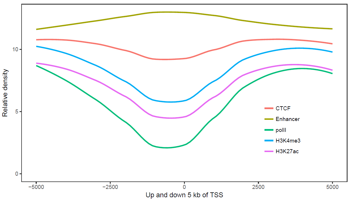
使用正常矩阵默认参数绘制个线图
# -f:指定输入的矩阵文件,第一列为行名字,第一行为header
列数不限,列名字不限;行数不限,行名字默认为文本
# -A FALSE:指定行名为数字
sp_lines.sh -f line_data.xls -A FALSE
# -l:设定图例的顺序
# -o TRUE:局部拟合获得平滑曲线
# -A FALSE:指定行名为数字
# -P:设置legend位置,相对于原点的坐标
# -x, -y指定横纵轴标记
sp_lines.sh -f line_data.xls -l"'CTCF','Enhancer','polII','H3K4me3','H3K27ac'" -P 'c(0.8,0.3)' -oTRUE -A FALSE -x 'Up and down 5 kb of TSS' -y 'Relative density'
# -A FALSE:指定行名为数字
# -V 'c(-1000, 500)':设置垂线的位置
# -D:设置垂线的文本标记,参数为引号引起来的vector,注意引号的嵌套
# -I:设置横轴的标记的位置
# -b:设置横轴标记的文字
sp_lines.sh -f line_data.xls -A FALSE -V'c(-1000,500)' -D "c('+1 kb','-0.5 kb')" -I"c(-5000,0,5000)" -b "c('-5 kb', 'TSS', '+5 kb')"
使用melted矩阵默认参数绘制个线图(除需要改变文件格式,指定-m TRUE, -a xvariable外其它与正常矩阵一样)
# -f:指定输入文件
# -m TRUE:指定输入的矩阵为melted
format,三列,第一列为Pos (给-a)
#第二列为variable (给-H,-H默认即为variable)
#第三列为value,名字不可修改
# -A FALSE:指定行名为数字
# -P 'c(0.8,0.2)':设置legend位置,相对于原点的坐标
sp_lines.sh -f line_data_melt.xls -a Pos -mTRUE -A FALSE -P 'c(0.8,0.2)'
完整的图
# -C:自定义线的颜色
sp_lines.sh -f line_data_melt.xls -a Pos -mTRUE -A FALSE -P 'c(0.8,0.2)' -o TRUE -V 'c(-1000,500)' -D "c('+1kb','-0.5 kb')" -I "c(-5000,0,4000)" -b "c('-5 kb', 'TSS','+4 kb')" -x 'Up 5 kb and down 4 kb of TSS' -y 'Relative density' -C"'pink', 'blue'"
参数中最需要注意的是引号的使用:
外层引号与内层引号不能相同
凡参数值中包括了空格,括号,逗号等都用引号括起来作为一个整体。
完整参数列表如下:
ct@ehbio:~ $sp_lines.sh
***CREATED BY Chen Tong (chentong_biology@163.com)***
Usage:
/MPATHB/self/s-plot/sp_lines.sh options
Function:
This script is used to draw a line ormultiple lines using ggplot2.
You can specify whether or not smooth yourline or lines.
Two types of input files are supported,normal matrix or melted matrix format. Column separator for both types of inputfiles is **tab**.
Here is an example of normal matrix format.The first column will be treated as X-axis variables and other columns representseach type of lines. The number of columns is unlimited and names of columns isunlimited.
**Set** column is not needed. If given, (multiple plots in one page) could be displayed.
------------------------------------------------------------
PosH3K27acCTCFEnhancerH3K4me3polII
-50008.7129810.6913011.735910.025108.26866
-40008.4324610.7668011.84429.769277.78358
-30008.2549710.5441012.24709.403466.96859
-20007.1626510.8635012.68898.350704.84365
-10003.553418.4575112.83724.846801.26110
03.550308.5031613.41525.174011.50022
10007.0750210.9143012.35888.139094.88096
20008.2432810.7022012.38889.472557.67968
30008.4386910.4101011.97609.806657.94148
40008.4887710.5757011.65629.719868.17849
------------------------------------------------------
------------WithSET------------------------------------------
PosH3K27acCTCFEnhancerH3K4me3polIISet
-50008.7129810.6913011.735910.025108.268661
-40008.4324610.7668011.84429.769277.783581
-30008.2549710.5441012.24709.403466.968591
-20007.1626510.8635012.68898.350704.843651
-10003.553418.4575112.83724.846801.261101
03.550308.5031613.41525.174011.500221
10007.0750210.9143012.35888.139094.880961
20008.2432810.7022012.38889.472557.679681
30008.4386910.4101011.97609.806657.941481
40008.4887710.5757011.65629.719868.178491
-50008.7129810.6913011.735910.025108.268662
-40008.4324610.7668011.84429.769277.783582
-30008.2549710.5441012.24709.403466.968592
-20007.1626510.8635012.68898.350704.843652
-10003.553418.4575112.83724.846801.261102
03.550308.5031613.41525.174011.500222
10007.0750210.9143012.35888.139094.880962
20008.2432810.7022012.38889.472557.679682
30008.4386910.4101011.97609.806657.941482
40008.4887710.5757011.65629.719868.178492
-------------------------------------------------------------
For matrix format, example command linesinclude:
* Attribute of X-axis value (first columnof matrix) is
s-plotlines -f matrix.file -A FALSE
* Attribute of X-axis value (first columnof matrix) is
s-plotlines -f matrix.file
* Attribute of X-axis value (first columnof matrix) is numbers, change legned order (default alphabet order)
s-plotlines -f matrix.file -l "'polII', 'CTCF', 'Enhancer', 'H3K27ac','H3K4me3'"
* Attribute of X-axis value (first columnof matrix) is numbers, change legned order (default alphabet order), smoothlines to look better (Pay attention to whether this will change the data trend)
s-plotlines -f matrix.file -l "'polII', 'CTCF', 'Enhancer', 'H3K27ac','H3K4me3'" -o TRUE
* Attribute of X-axis value (first columnof matrix) is numbers, with  (Set is column name) column
s-plotlines -f matrix.file -F "+facet_grid(Set ~ ., scale='free_y')"
FILEFORMAT when -m is true
#The name "value" shoud **not**be altered.
#variable can be altered using -H
#Actually this format is the melted resultof last format.
--------------------------------------------------------------
Pos variablevalue
-5000H3K27ac8.71298
-4000H3K27ac8.43246
-3000H3K27ac8.25497
-2000H3K27ac7.16265
-1000H3K27ac3.55341
0H3K27ac3.55030
1000H3K27ac7.07502
2000H3K27ac8.24328
3000H3K27ac8.43869
4000H3K27ac8.48877
-5000CTCF10.69130
-4000CTCF10.76680
-3000CTCF10.54410
-2000CTCF10.86350
-1000CTCF8.45751
0CTCF8.50316
1000CTCF10.91430
2000CTCF10.70220
3000CTCF10.41010
4000CTCF10.57570
-------------------------------------------------------------
* Attribute of X-axis value (melt format)is
s-plotlines -f matrix.file -m TRUE -a Pos -A FALSE
* Attribute of X-axis value (first columnof matrix) is
s-plotlines -f matrix.file -m TRUE -a Pos
* If the name of the second column is not , one should specify with <-H>.
s-plotlines -f matrix.file -A FALSE -m TRUE -a Pos -H type
* Attribute of X-axis value (first columnof matrix) is numbers, change legned order (default alphabet order)
s-plotlines -f matrix.file -m TRUE -a Pos -l "'polII', 'CTCF', 'Enhancer','H3K27ac', 'H3K4me3'"
* Attribute of X-axis value (first columnof matrix) is numbers, change legned order (default alphabet order), smoothlines to look better (Pay attention to whether this will change the data trend)
s-plotlines -f matrix.file -m TRUE -a Pos -l "'polII', 'CTCF', 'Enhancer','H3K27ac', 'H3K4me3'" -o TRUE
* Attribute of X-axis value (first columnof matrix) is numbers, with  (Set is column name) column
s-plotlines -f matrix.file -F "+facet_grid(Set ~ ., scale='free_y')"
OPTIONS:
-fData file (with header line, the firstcolumn would be be treated as rownames for
normalmatrix. No rownames for melted format. Columns are tab seperated)
[NECESSARY]
-mWhen true, it will skip melt preprocesses. Butthe format must be
thesame as listed before.
[DefaultFALSE, accept TRUE]
-aName for x-axis variable
[Onlyneeded when <-m> is
.
Forthe melted data, 'Pos' should be given here.
Fornormal matrix,default the first columnwill be used,
programwill assign an value 'xvariable' to represent it.
]]
-AAre x-axis variables numbers.
[Default
, meaning X-axis label is .
means X-axis label is .]
-HName for legend variable.
[Defaultvariable, this should only be set when -m is TRUE]
-JName for color variable.
[Defaultsame as -H, this should only be set when -m is TRUE]
-lSet orders of legend variable.
[Defaultcolumn order for normal matrix, accept a string like
"'CTCF','H3K27ac','Enhancer'"to set your own order.
Payattention to the usage of two types of quotes.
***When-m is TRUE, default order would be alphabet order.*********
]
-PLegend position[Default right. Accept
top,bottom, left, none, or 'c(0.08,0.8)'.]
-LLevels for x-axis variable, suitable whenx-axis is not treated as numerical.
[Defaultthe order of first column for normal matrix.
Accepta string like "'g','a','j','x','s','c','o','u'" to set your own oder.
Thiswill only be considered when -A is TRUE.
***When-m is used, this default order would be alphabet order.*********
]
-oSmooth lines or not.
[DefaultFALSE means no smooth. Accept TRUE to smooth lines.]
-OThe smooth method you want to use.
[smoothingmethod (function) to use,eg. lm, glm,gam, loess,rlm.
Fordatasets with n < 1000 default is 'loess'.
Fordatasets with 1000 or more observations defaults to 'gam'.
]
-VAdd vertical lines.[Default FALSE, accept aseries of
numbersin following format "c(1,2,3,4,5)" or other
Rcode that can generate a vector.]
-DAdd labels to vlines.
[Defaultsame as -V.
Accepta series of numbers in following format "c(1,2,3,4,5)" or other Rcode
thatcan generate a vector as labels.
Orone can give '1' to disallow labels]
-jAdd horizontal lines.[Default FALSE, accepta series of
numbersin following format "c(1,2,3,4,5)" or other
Rcode that can generate a vector]
-dAdd labels to hline.
[Defaultsame as -j
Accepta series of numbers in following format "c(1,2,3,4,5)" or other Rcode
thatcan generate a vector as labels.
Orone can give '1' to disallow labels]
-IManually set the position of xtics.
[DefaultFALSE,accept a series of
numbersin following format "c(1,2,3,4,5)" or other R code
thatcan generate a vector to set the position of xtics]
-bManually set the value of xtics when -I isspecified.
[Defaultthe content of -I when -I is specified,
accepta series of numbers in following format "c(1,2,3,4,5)" or other Rcode
thatcan generate a vector to set the position of xtics]
-XDisplay xtics. [Default TRUE]
-YDisplay ytics. [Default TRUE]
-RRotation angle for x-axis labels (anticlockwise)
[Default0]
-Bline size. [Default 1. Accept a number.]
-tTitle of picture[Default empty title]
-xxlab of picture[Default empty xlab]
-yylab of picture[Default empty ylab]
-cManually set colors for each line.[DefaultFALSE, meaning using ggplot2 default.]
-CColor for each line.
When -c is TRUE, one has two options:
1.Supplying a function to generate colors,
like"rainbow(11)" or "rainbow(11, alpha=0.6)",
rainbow is an R color palletes,
11 is the number of colors you want to get,
0.6is the alpha value.
TheR palletes include , ,
,.
2.Supplying a list of colors in given format,
thenumber of colors should be equal to the number of
barslike "'red','pink','blue','cyan','green','yellow'" or
"rgb(255/255,0/255,0/255),rgb(255/255,0/255,255/255),
rgb(0/255,0/255,255/255),rgb(0/255,255/255,255/255),
rgb(0/255,255/255,0/255),rgb(255/255,255/255,0/255)"
Onecan use R fucntion  to list all available colors.
-sScale y axis
[Defaultnull. Accept TRUE. This function is depleted.
Butif the supplied number after -S is not 0, this parameter will be set to TRUE]
-FThe formula for facets.[Default no facets,
"+facet_grid(level~ .)" means divide by levels of 'level' vertically.
"+facet_grid(.~ level)" means divide by levels of 'level' horizontally.
"+facet_grid(lev1~ lev2)" means divide by lev1 vertically and lev2 horizontally.
"+facet_wrap(~level,ncol=2)" means wrap horizontally with 2 columns.
#Payattention to the single quote for parameters in function for scale.
Example:"+facet_wrap(~Size,ncol=6,scale='free')"
Example:"+facet_grid(Size ~ .,scale='free_y')"
]
-GIf facet is given, you may want to specifizethe order of
variablein your facet, default alphabetical order.
[Acceptsth like (one level one sentence, separate by';')
'data$size<- factor(data$size, levels=c("l1","l2",...,"l10"), ordered=T)' ]
-vIf scale is TRUE, give the following'scale_y_log10()'[default], 'coord_trans(y="log10")',
orother legal command for ggplot2 or simply 'log2'.]
-SA number to add if scale is used.
[Default0. If a non-zero number is given, -s would be set to TRUE.]
-pOther legal R codes for gggplot2 could begiven here.
[Beginwith '+' ]
-wThe width of output picture (cm).[Default 20]
-uThe height of output picture (cm).[Default12]
-EThe type of output figures.[Default pdf,accept
eps/ps,tex (pictex), png, jpeg, tiff, bmp, svg and wmf)]
-rThe resolution of output picture.[Default300 ppi]
-zIs there a header. Must be TRUE. [DefaultTRUE]
-eExecute or not[Default TRUE]
-iInstall depended packages[Default FALSE]
为了推广,也为了激起大家的热情,如果想要sp_lines.sh脚本的,还需要劳烦大家动动手,转发此文章到朋友圈,并留言索取。
也希望大家能一起开发,完善功能。
Reference
*http://blog.genesino.com//2017/06/R-Rstudio
